CAD SOLO Title
Project Goals
Save 25% of time on 80% of projects
Keep the workflow within the company’s platform
This efficiency improvement potentially translated into millions of dollars saved over the course of a year. Additionally, if we could save time while bringing the workflow into the company’s platform, we could package this software and offer CAD as a service to other solar installation companies.
Research
I initially began researching the CAD tool on my own, thinking it was a straightforward 5-step process as shown by the Product Manager. Before realizing how much I didn’t know, I had questions like:
What does this No Errors section do when there is an error?
What is this checkmark for?
What the hell do ESID and NABCEP stand for?
I soon realized that I lacked the complete picture and didn't even know which questions to ask when I approached the CAD team. So instead of spinning my wheels I walked upstairs to the team, introduced myself and started shadowing them in their process. After a few days of shadowing the CAD team and constantly asking how and why they did things, I started to understand the 'why' behind their actions, and my questions became more focused on their workflow:
Could we combine Page 1 and 2 to retain a better context of relevant information?
Page 4 has been replaced in the workflow with other fields, can we take it out completely?
Why is Excel faster to fill out, and can we replicate that functionality within our tool?
Ultimately I learned the scope of this project and the workflow I was tasked to consolidate and simplify. The workflow for at least 80% of jobs included:
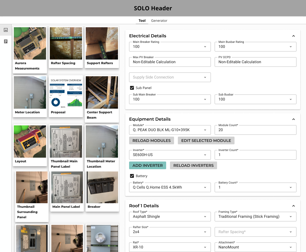
Filling out a lengthy 6-page form on SOLO’s internal tool
Performing calculations in Excel
Utilizing AutoCAD for detailed work
Exporting a final PDF permit packet
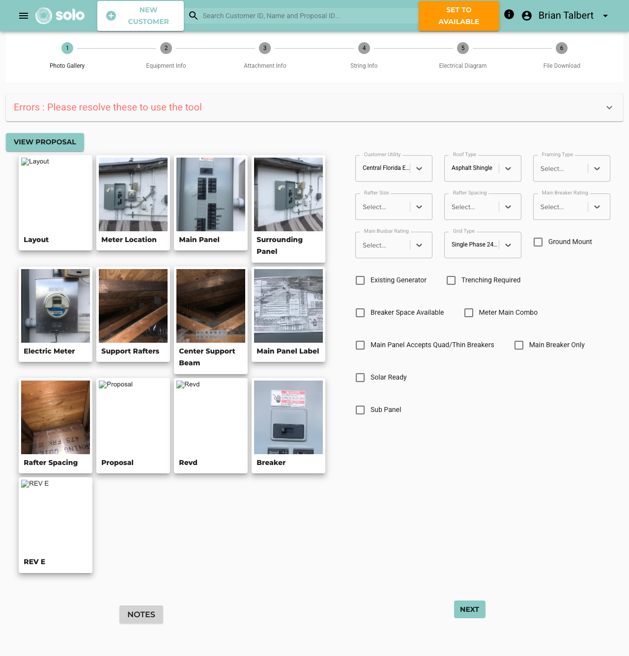
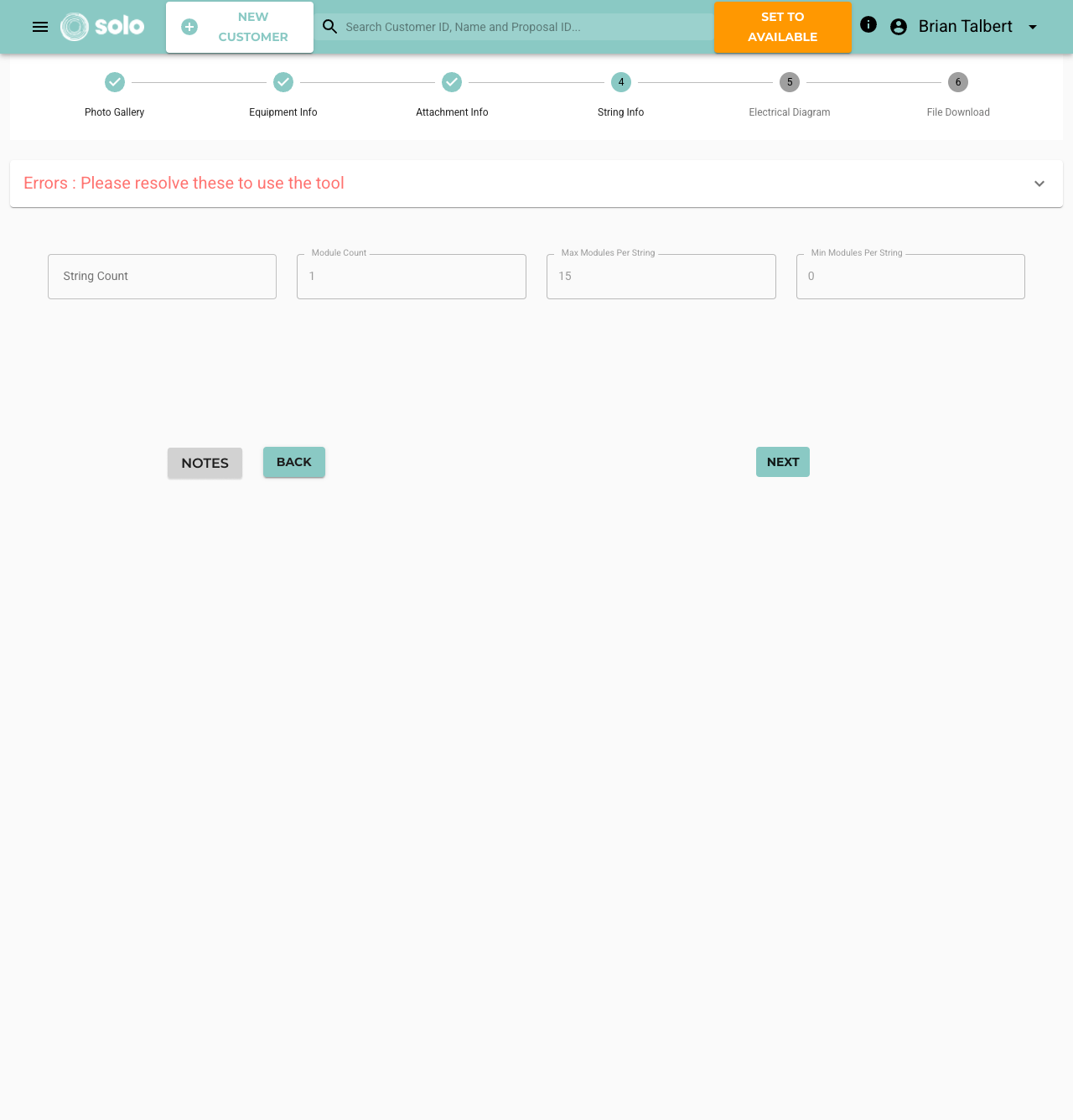
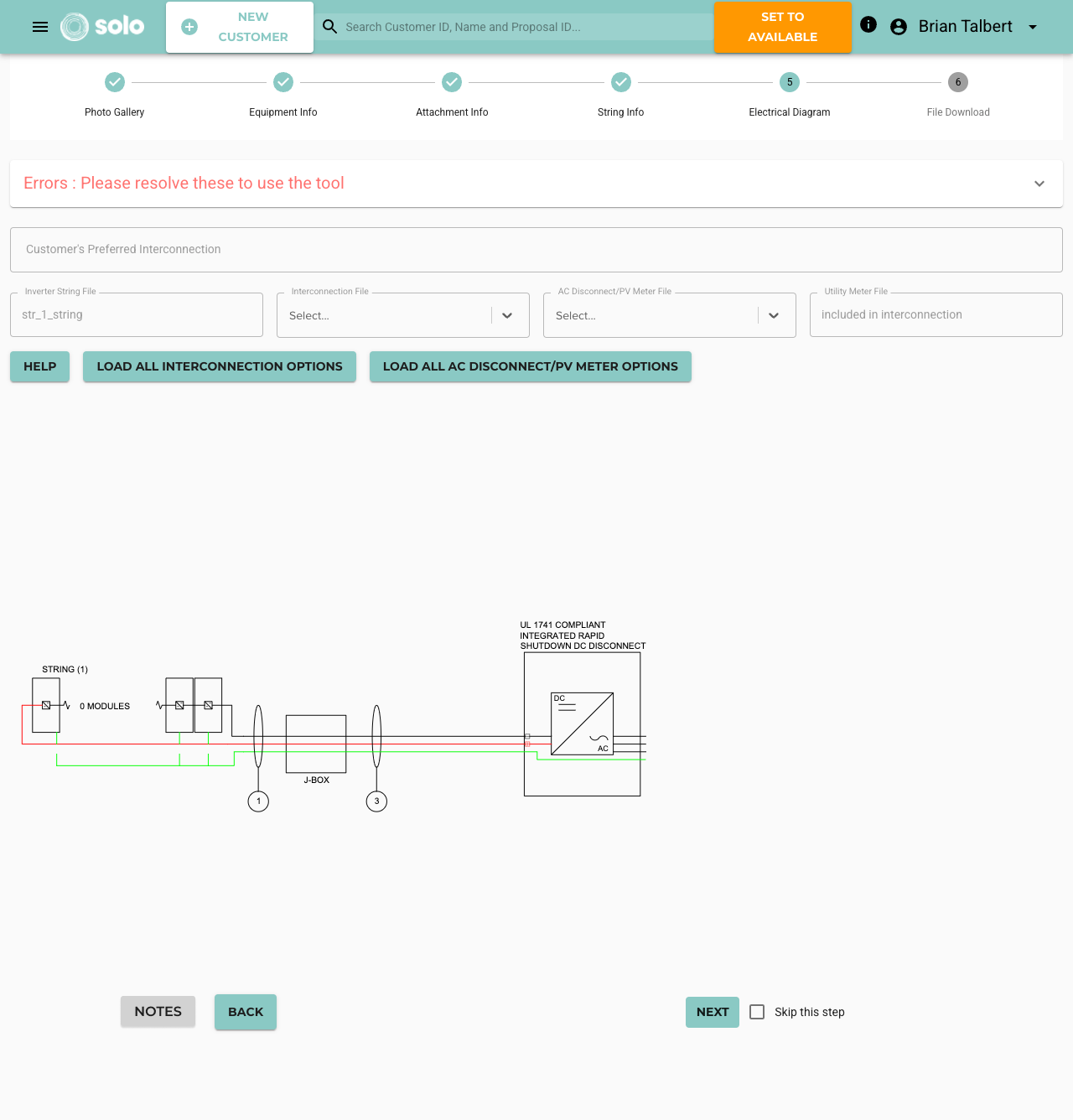
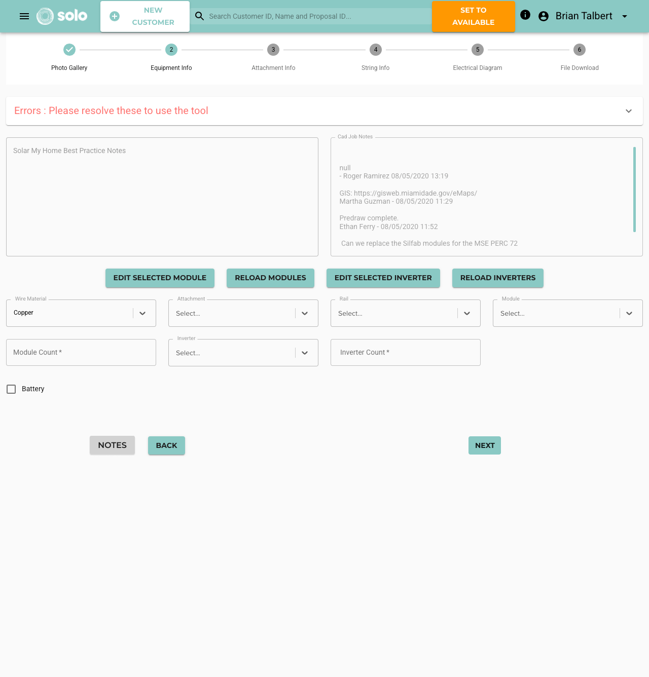
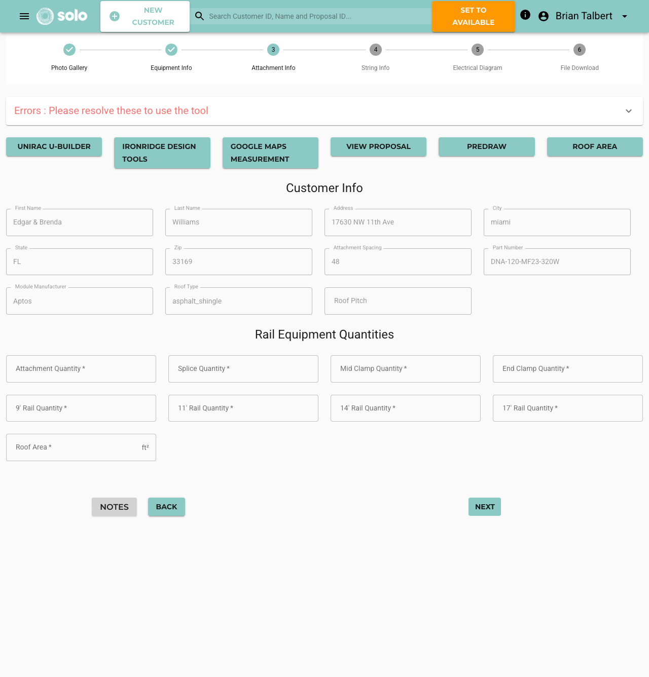
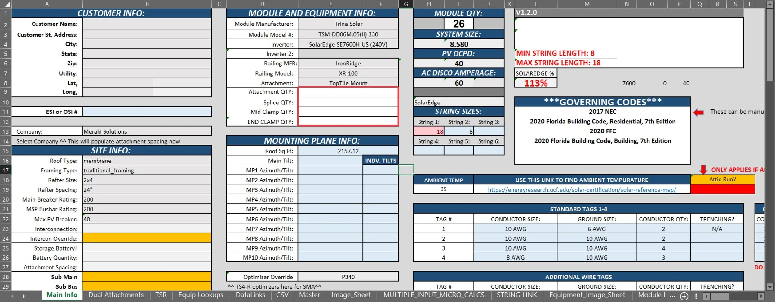
Screenshots of SOLO’s process and part of the custom Excel sheets used by SOLO Engineers
Involving Stakeholders
I organized a scoping meeting with the director of CAD, key stakeholders, developers, and the Product Manager (PM). I showed the devs and PM where the pain points were in the process based on feedback from the director and CAD engineers. The key takeaways from this meeting:
The CAD process was messy and had been designed on the fly by the team
They were excited to have the Product team tackling this so they could get back to their jobs
I was the only one on the Product team with intimate knowledge of the CAD workflow
A positive aspect of this project was that the team was accustomed to learning new processes and seeing improvements in their workflow, so they were excited about a simpler workflow. With a common goal among all stakeholders, and a much better understanding of the workflow, I had a direction to head in.
Roadblocks
After several meetings with all stakeholders, the dev team assigned to this project wanted to move on to a different product within the company, citing that this was an internal tool and our resources could be better utilized elsewhere.
I had a productive conversation with the dev lead on this point. As a newer UX Designer, I was shocked that someone would see a process and a team that needed some support and think to move on to a different project regardless. The dev lead explained that the four developers on the team, along with one UX designer and one PM, were too large a resource to assign to an internal tool that customers would never see. We talked about whether a product was more or less important if a customer or an employee was using it. I was convinced that we should continue working on the product because it immediately improved the lives of our colleagues and contributed to the goal of making the company a better place to work. Additionally, this tool was slated to become a software service that the company could sell, so eventually, the employee using it would become our customer.
Ultimately, neither of us were the decision maker in this, and the CTO and Product Director discussed it. The team was expanded to work on ALL internal improvements at the company, not just within the CAD department. The dev lead and I ended up working very well together, and we were able to discuss other ideas we initially disagreed on, ultimately creating better products as a result.
Implementation
After this roadblock I could start to focus on what “low-hanging fruit” there was that I could fix easily, and then work with the devs to evaluate the solutions for the more complex solutions.
By reorganizing the placement of required fields, sections headers, and grouping related information, I was able to take three pages into one all while keeping the required context on one screen.
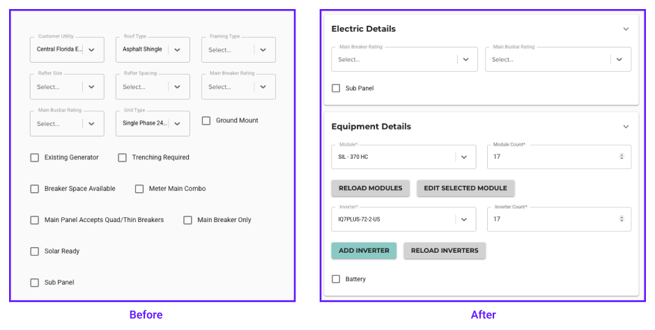
Reordering the fields across all three pages to fit the flow the users filled the form out in
After working through this change I brought it up to the CAD Team to demo. Just showing them the mock up they knew that this one change cut the time to complete a job by 10%. They were able to easily scan and scroll to see the required information they needed for a majority of jobs. This removed a lot of the need to go back and forth on pages within SOLO’s tool and even out to Excel.
The next significant improvement involved eliminating Excel from the process altogether for these 80% of jobs. By understanding the required mathematical calculations and having access to all necessary information within our platform, integrating these calculations became an achievable solution and one that the devs were excited to implement.
Upon presenting the 3 page design concept to the CAD team, there was enthusiasm and recognition of the benefits of organizing information logically and sequentially. Low-fidelity tests were conducted, and feedback from the design and development teams highlighted the potential to simplify further.
Initial wireframe idea of bringing the required Excel fields into SOLO’s platform
Initially I proposed a solution that looked very much like recreating Excel within SOLO’s platform (see above). This was quickly, and correctly, redirected by the dev team by suggesting using our existing text field components. We could still have the Tab and Enter navigation across the different fields but recreating Excel is rarely ever the correct option.
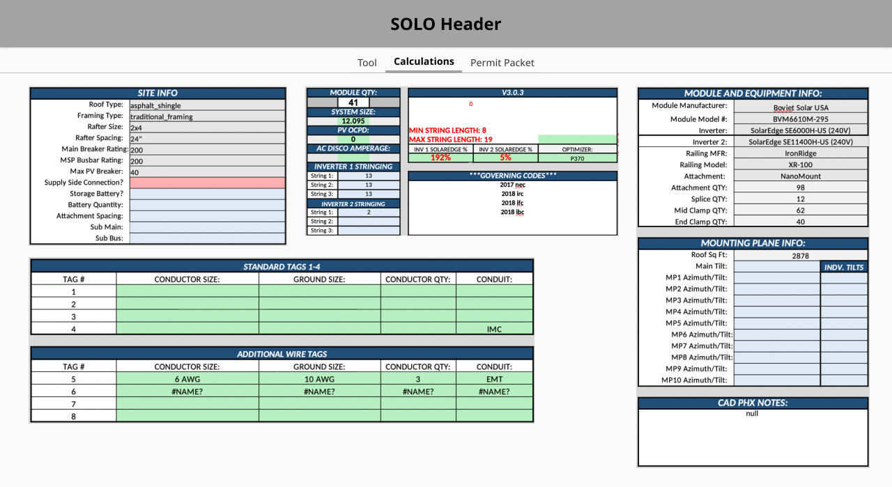
The exciting part is that if we were using the same text fields the Tool and Calculation pages could actually be consolidated together. This brought the calculations into the context of the rest of the tool, connecting the dots for many of the engineers on “why” data went where they had been trained to put it. This approach not only streamlined the workflow but also significantly reduced the learning curve for new hires.
Customer Images on one side and all 6 pages condensed into one on the other side including all Excel calculations
Conclusion
I had easy access to willing users for interviews, which helped establish strong relationships, making research and iterations easier because of their honest feedback.
I learned how to defend my work and impact at the company when working on an internal tool which reinforced the importance of UX at the business level, in addition to making a usable, and highly functional product.
I learned the importance of involving devs early in a project, especially with customer interviews. Seeing the workflow context made their jobs easier and improved relationships between users and the dev team.
As one of my first real-world projects outside of school, I quickly learned that usability is far more important than aesthetics, especially when defending your work to the business.
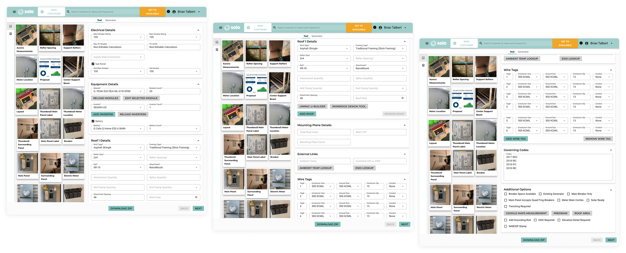
Complete CAD workflow fit on 2 tabs, compared to the 6 screenshots at the start of this article.